|
|
Post by Karl on Oct 7, 2015 22:06:06 GMT 1
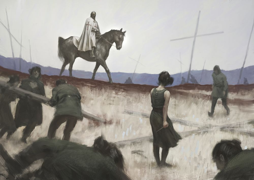
Alright, so here's one painting I did a while back but never finished for some reason... Help me figure out why! Tear it to shreds!  |
|
vili
New Member

Posts: 5 
|
Post by vili on Oct 7, 2015 22:29:59 GMT 1
Hey man, thanks for putting up this forum so quickly. Really like the composition and feel of the painting, however I feel like the background is a bit bland.
|
|
|
|
Post by William on Oct 7, 2015 22:43:41 GMT 1
Cool painting Karl! I like that the focal points are very clear, I would like to know who she is, and what she's planning. Tasty brush strokes! Here's a thought that I had! The value range is limited, which combined with the limited palette and low saturation adds to a certain feel, which I like. I would however switch up the values a bit, to differentiate stuff from each other that are kind of merging together. I'm thinking about the third guy to the left with the head right underneath the horses back legs. The value of his head is very similar to the horse, as well as the muddy road that the horse travels on. Even if he shares the same value as the other people, the others are somewhat separated by other elements in the image such as the line where. The most left woman/man shares the same "problem" but is a much less important character so it doesn't really matter to me. puu.sh/kC9tG/c8ba0f85c0.jpg - Here's a quick overpaint of what I'm thinking, it's very quickly made to show my idea, so take it with a grain of salt. I added some fog underneath the horse to push that "plane" in a bit further into the image and to make the horslegsman appear more clear. I do not intend him to be fighting for the current focal points so the fog can be altered if that's the case. The left most man/woman shares the same "issue" (not an issue really) but he/she/ is much less of an important character for the image so it doesn't really matter in my opinion. Maybe the fog can be exaggerated around the base of the horse without making the knight feel less important, because initally that's what I had thought. He's the only one having a very clear gaze in the image which imediately catches our attention as human beings. Loving it! Keep on going, just brainstorming with you. Why fog you might say? Well fog is basically a cloud, and clouds are amazing! The pink lines are just to show what I mean with lines that separate the people from the background. I'm sure you get it! Oh and thank you so much for putting up the forum, brilliant!  |
|
|
|
Post by Karl on Oct 8, 2015 18:32:26 GMT 1
Thanks guys! William: Hey, thanks for taking time to give such good feedback man! I think you're totally right it needs a bit more of a separation of value and sence of space. The atmospheric fog works pretty nice actually! Vili's right the background looks a bit bland so I think getting more value variations in there between the different planes will help a lot like you said. Cool! Maybe I'll actually end up finishing it now...  |
|
|
|
Post by danitiwa on Oct 9, 2015 21:39:05 GMT 1
This might be way less important than what the other guys said, but the horse's tail has an edge that is an almost perfect vertical line. I can't understand if it's intentional and it kind of misleads the eye a bit... (Instead of looking at the main characters the horse's tail is the first thing that gets my attention.)
I really do like it and hope you do finish it!
|
|
|
|
Post by Karl on Oct 10, 2015 11:31:56 GMT 1
Thanks Dani! Your right it looks a bit weird! I'll remember to fix that if I decide to finish it!
|
|